Party Assistant
An Tool for making plans with Friends

Problem
Create a digital solution that makes finding time with friends easy. This was a design exercise.
Solution
A tool that makes it easy to find times that work for a party and find restaurants that can accomodate.
Step 1: Reframing the Problem
"If I had an hour to solve a problem and my life depended on the solution, I would spend the first fifty-five minutes determining the proper question to ask, for once I know the proper question, I could solve the problem in less than five minutes."
– Albert Einstein
At the start of a design project I like to spend some time reframing the problem into one that creates a clearer path forward.
In this case, reframing the problem as, “What makes party planning inconvenient and uncomfortable?”, forced me to investigate those questions to start.
Step 2: USER INTERVIEW
Here, I took advantage of the fact that the biggest party planner I know is my wife. I asked her to recall the last time she had made plans, what she did, what were her pain-points, etc.
Her top 3 pain points were:
Finding a time that worked for everyone
Finding restaurants that have availability for her party size and time needed.
Getting people to commit
Step 2: Observational research
Mining my company’s Slack #lunch-today channel for insights
My company has a slack channel called, #lunch-today, which people use to organize team lunch outings. On a good day, this is what happens:
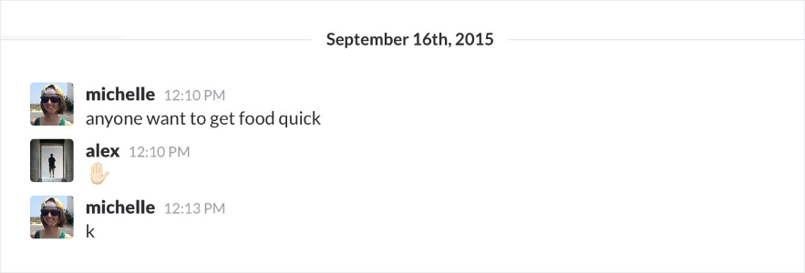
Simple invite followed by a simple response.
But more often it looked like this:
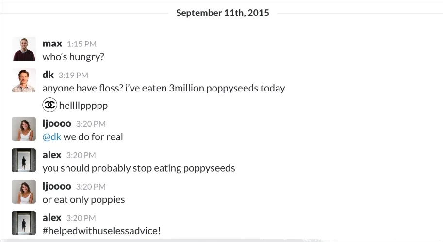
Endless, off-topic comments that ended in an unsuccessful team outing.
Takeaway
Avoid extraneous features that distract from the invitation.
Strategy
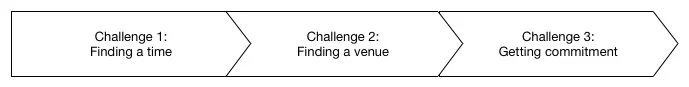
Based on takeaways from the research phase, I noticed there seemed to be three distinct phases, each with a distinct challenge, in planning for groups:
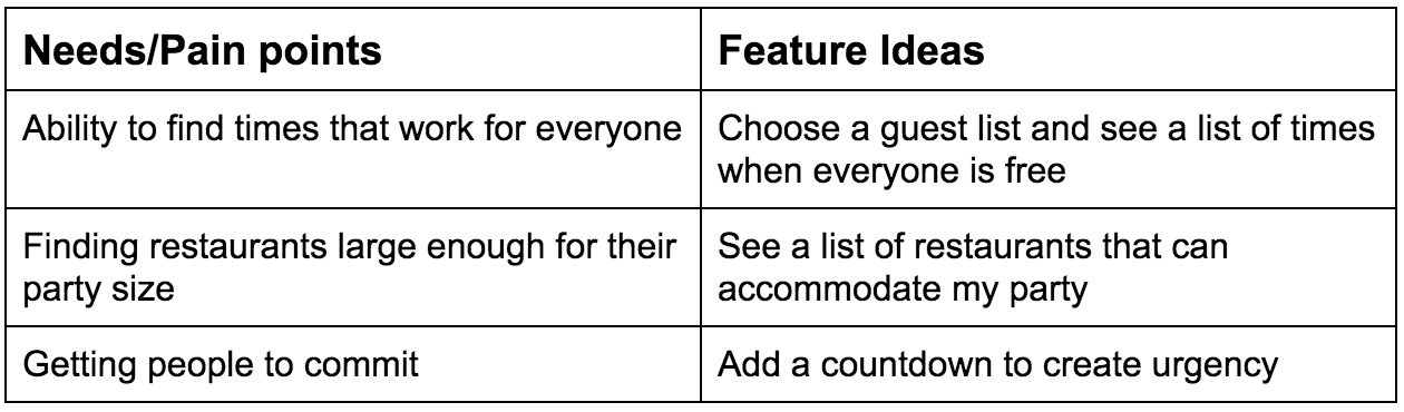
Next I compiled the list of needs and developed some feature ideas to address those needs:
I then ranked the feature ideas into must have and could have categories, and created a won’t have categories to document things we wanted to avoid:
Must have
Choose a guest list and see a list of times we’re all free
See a list of restaurants that can accommodate my party
Could have
Ability to book a reservation through the app
Show an RSVP deadline to get people to commit
Won’t have
Chat, polling
User Flows
I mapped out the high-level flow to understand how these features could be included in one cohesive flow. The goal was to make the process convenient and comfortable, so a map likes this helped me simplify the flow before diving into the specifics of the interface.
Content Audit to Wireframes
During this phase I started by mapping out the content and interactions for each screen.
I often do this on paper, but find that a low fidelity digital prototype, leveraging existing patterns and templates, can often be developed as quickly.
High Fidelity Mockups
Finally, I sketched high-fidelity versions of the key screens to start exploring how the look and feel, including the use of imagery, can add clarity to the interface. I chose to experiment with Material design to familiarize myself with the guidelines.
Next Steps: Measuring
If I were to continue with this project my next steps would be:
User interviews to validate whether proposed design solutions meet the user needs.
More thorough competitive analysis (I did some, but for sake of time didn't include it here).
And then eventually, if the app were planned to be built, determining what to measure:
On-boarding conversion
Number of invites being created
Number of invites per user
Percentage of invitees that respond yes, no, don't respond
Stats around feature usage: percentage of users who click on recommendations, book a restaurant reservation, etc.
Retention
Final Thoughts
Despite trying to reduce the number of features, the end result could be simpler. I avoided the pitfalls of building in things like polling and chat but during user testing it should also be assessed if there are other features (e.g. restaurant booking) that may be better left to another service.
The goal of trying to get people to be more committal (phase 3) was the biggest challenge. Unlike the other features that strived to streamline existing processes (e.g. finding times that work for a group), or to string together separate services (e.g. find a time + book a restaurant), increasing the likelihood of commitment is deeply rooted in our behavior, so that aspect needs a much more thorough investigation.
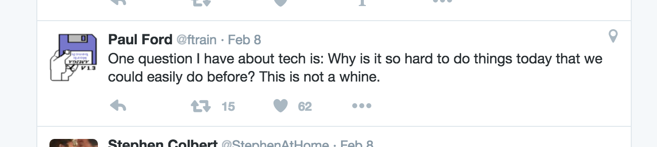
In the middle of me working on this project, I saw this tweet by Paul Ford (right), which I thought was timely given the this project. I read it as a call for designers to acknowledge when design and technology have made things less convenient and to strive to create tools that truly enable us to live more simply and comfortably.